Firefly
A multi-platform design system for Civica, built accessibility-first and published for public use.
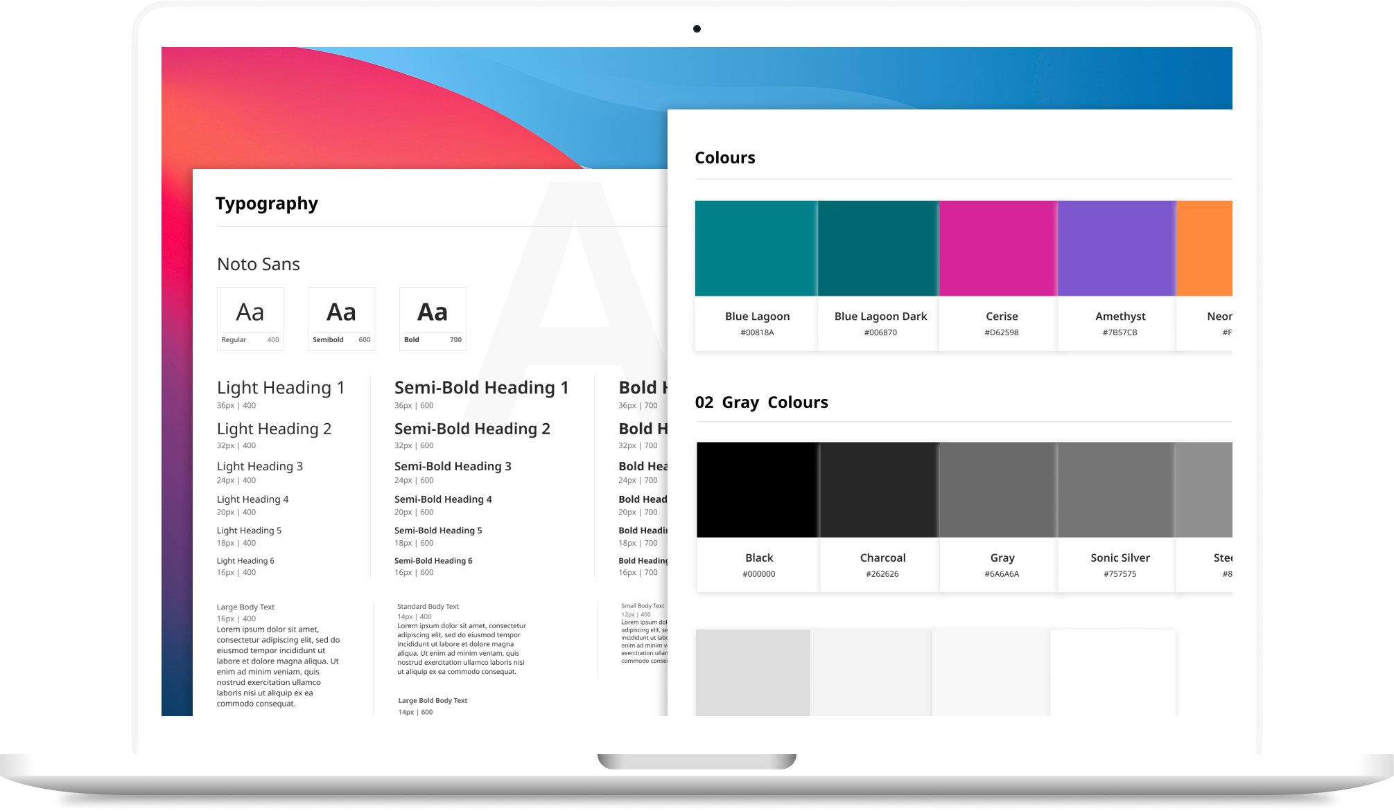
Four products. Six button styles. Three icon sets. Over two hundred and forty components that were supposed to be the same component.
Civica shipped four products built by four teams, none of which shared a definition of anything. The same control looked different in each, and every new screen was a fresh negotiation about which version was correct.
I built the source of truth: the foundations, the colour palette, the accessibility grid, the icon system and the HTML component library. Platform teams then ported that specification into Angular and Blazor.
It is published at firefly.civica.com (opens in a new tab), which means every claim on this page can be checked by opening it.
Problem
Civica shipped four products built by four teams, none of which shared a definition of anything. Four UIs for the same control became the default. Accessibility was handled per-product, per-release, and mostly at the end — a pattern that meant every system shipped with a different AA pass rate, if it shipped accessible at all.
- 240+ inconsistent components across four products
- 6 button styles and 3 icon sets for the same jobs
- Accessibility handled per-product, per-release, and mostly at the end
- Every new screen re-litigating decisions already made elsewhere
- No shared vocabulary between design and the four engineering teams
Solution
I built the source of truth: the foundations, the colour palette, the accessibility grid, the icon system and the HTML component library. Platform teams then ported that specification into Angular and Blazor. The system is published at firefly.civica.com (opens in a new tab), which means every claim on this page can be checked by opening it.
-
−40%
Sprint rework
-
68% → 100%
WCAG AA pass rate
-
3
Platform implementations
-
200+
Icons
-
4
Products unified
-
v1.3.0
Public, versioned, in use
- 1Inventory
- 2Grid
- 3Foundations
- 4Components
- 5Enablement
- 6Governance
Inventory
I screenshotted every unique instance of typography, buttons, icons, inputs and dropdowns across all four products and put them on one wall. That artefact did more persuading than any argument I could have made — the case for a system is very hard to dispute once you can see six versions of a primary button side by side.
The audit produced the priority list the rest of the work ran on: which components existed in the most variants, which carried the most accessibility debt, and which blocked the most teams.
Interface inventory wall — replace with export
The grid
Before any component was built, I produced a contrast matrix: every palette colour against every other, with computed ratios marked AA, AAA or AA18. Combinations that don’t appear on it are combinations that don’t pass.
This is where the system stopped being a style guide. The brand palette included Neon Carrot, and the maths said it cleared AA against exactly one background. So the system permanently restricts it to graphic treatments and symbols, and bars it from text and interface elements.
That rule is worth stating plainly, because it is the whole argument for doing accessibility first: brand handed over a colour, the audit determined what it could and could not do, and the system now enforces that decision without anyone needing to remember it. The constraint is a consequence of the evidence, not a preference sitting alongside it.
Accessibility contrast grid — replace with export
Foundations
Colour, typography, grid, imagery and icons, built before any complex component. The icon set runs to 200+ SVGs with a token-based size and colour API, so a developer changes an icon’s scale or colour through a class rather than by editing a file.
Components
The HTML library covers the full working set — form controls, navigation, tables, overlays, feedback and layout. Each component ships documented, with its accessible behaviour defined rather than left to the implementing team.
Component detail — states, variants, documentation — replace with exports
Enablement
A system nobody can install is a mood board. The published site carries installation instructions, a known-issues page and a release history, so a developer joining a team can adopt the library without talking to anyone first.
The known-issues page is the part I’d defend hardest. Publishing what’s broken is what separates a system teams trust from one they work around.
Governance
I built the source of truth. Angular and Blazor were ports, implemented by platform teams against my specifications — three platform implementations from one definition.
That handoff is the governance work: deciding what a component is tightly enough that three separate codebases can implement it without drifting, then versioning the whole thing so consumers know what changed. The system is currently at v1.3.0.
Evidence
Publicly verifiable. The component library, foundations, accessibility grid, icon set, release history and version number are all live at firefly.civica.com. Anyone assessing this page can check it directly.
Reported internally. The 40% sprint rework reduction and the shift in AA pass rate from 68% to 100% were measured by Civica, not by me.
Scope, stated precisely. I built the foundations, accessibility grid and HTML component library. The Angular and Blazor libraries are ports built by platform teams against those specifications.