Edison
Patient administration system for NHS health teams
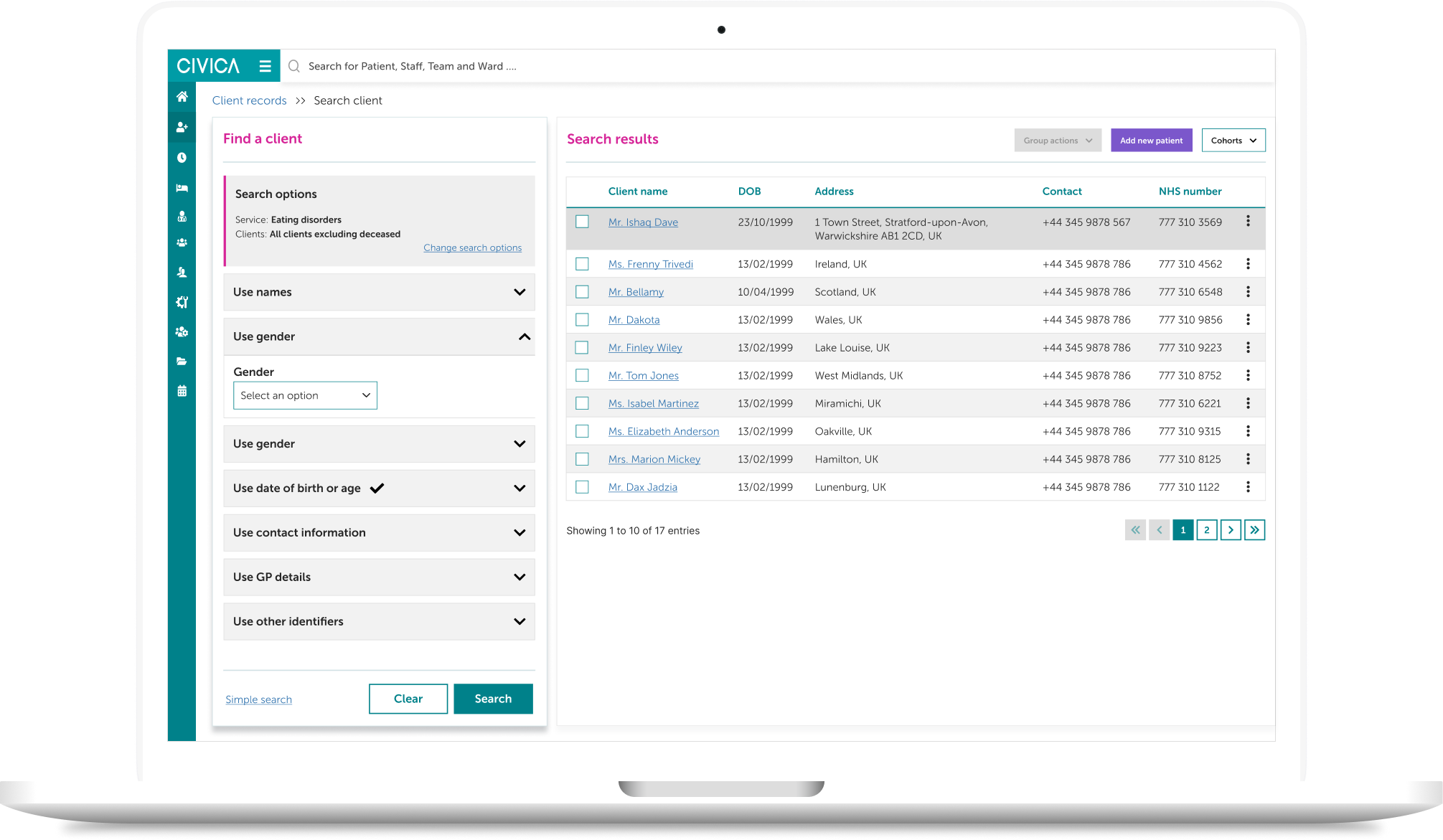
Edison replaced Paris, the legacy desktop product used across NHS Health and Care services. The brief was to cut the administrative overhead of client care so clinical staff spend less time in the system and more time with patients.
It was important to understand what exactly users would want to accomplish using the system. We went through user stories and reviewed discovery findings with the Edison product management team to get a clear vision of design goals.
Analyze the problems and identify opportunities
User research
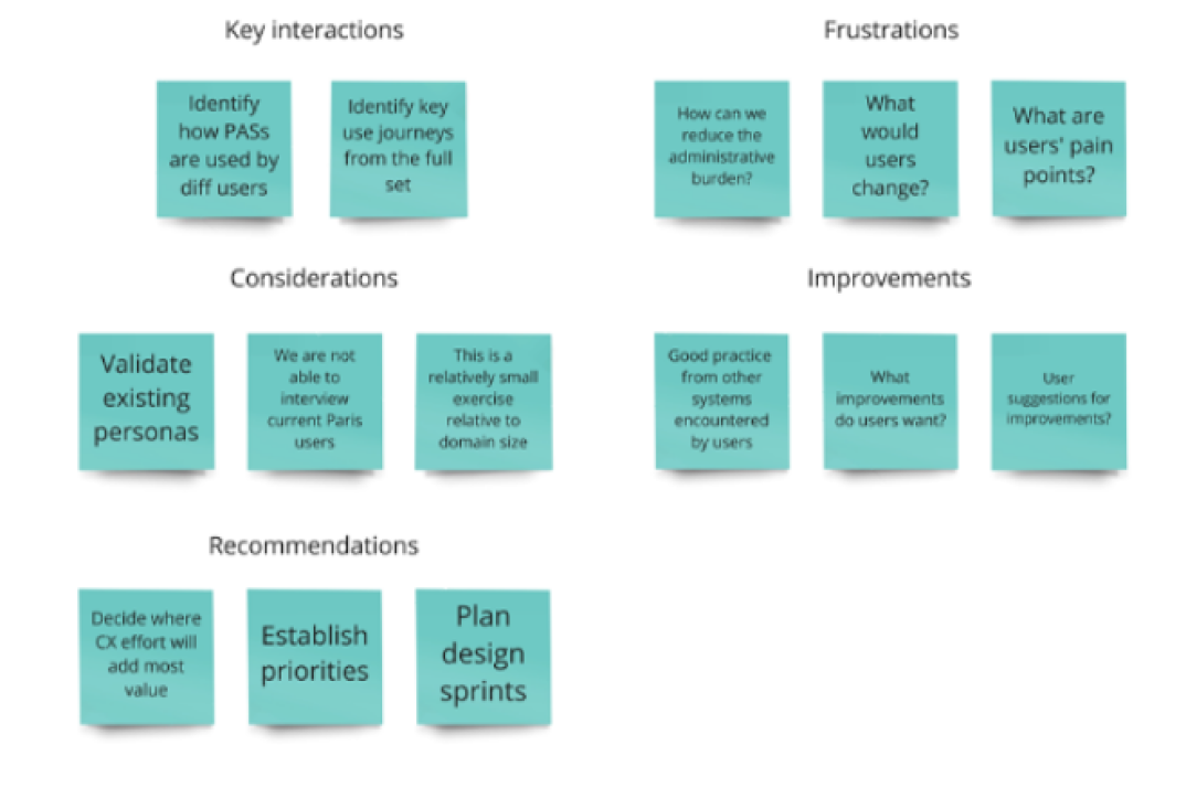
To understand users' frustrations, goals, and requirements, Central Government conducted user research and created user journeys and personas based on the existing system by conducting user interviews, then handed the findings across as a research report. Analysis was carried out on approximately 50 user journeys to gain insight into roles, explore relevant client-admin tasks, and identify high-level use cases — the synthesis of that existing research was our work, not the original data collection.
Client questions:
Key objectives included:
- Gaining an understanding of participants' roles and responsibilities.
- What systems they used and how their tasks and processes were carried out in those systems.
- Any challenges they faced, as well as any positive features of the current systems they used.
- Understanding what terminology they used.
- Any access needs or any assistive technologies they used.
Secondary research
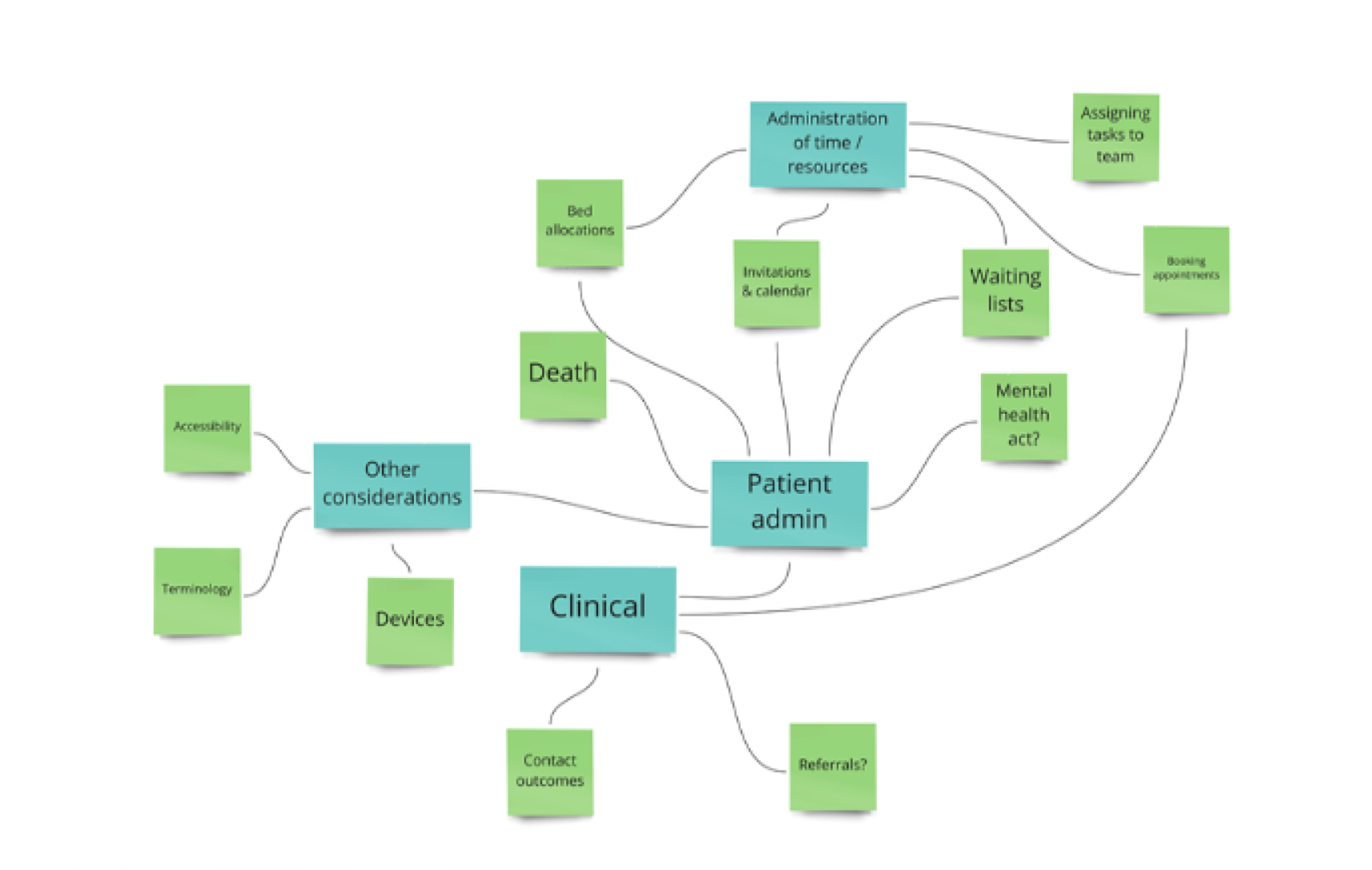
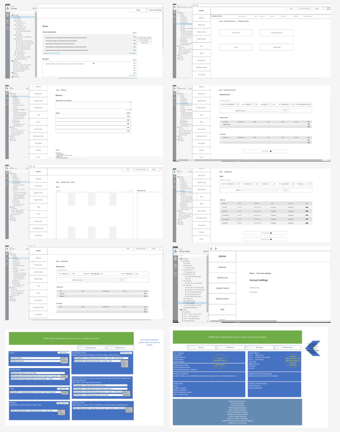
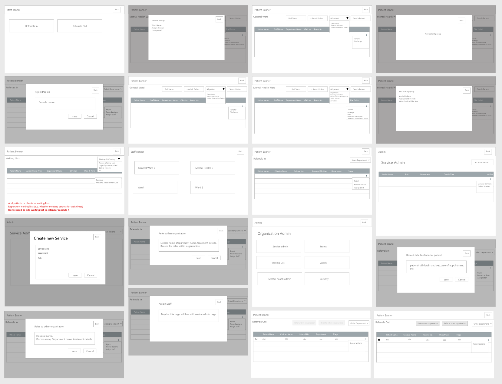
Our team started off with a meeting to go over the project plan and familiarise ourselves with the existing product as well as user requirements. Since this project is a replacement/continuation of the initial Paris project, we were given a lot of documentation to review by the Health & Care team. We went through other products available online to get better insight into functionalities such as referrals, waiting lists, organisation admin, and cohorts, while also reviewing documents and wireframes given to us by the business unit.
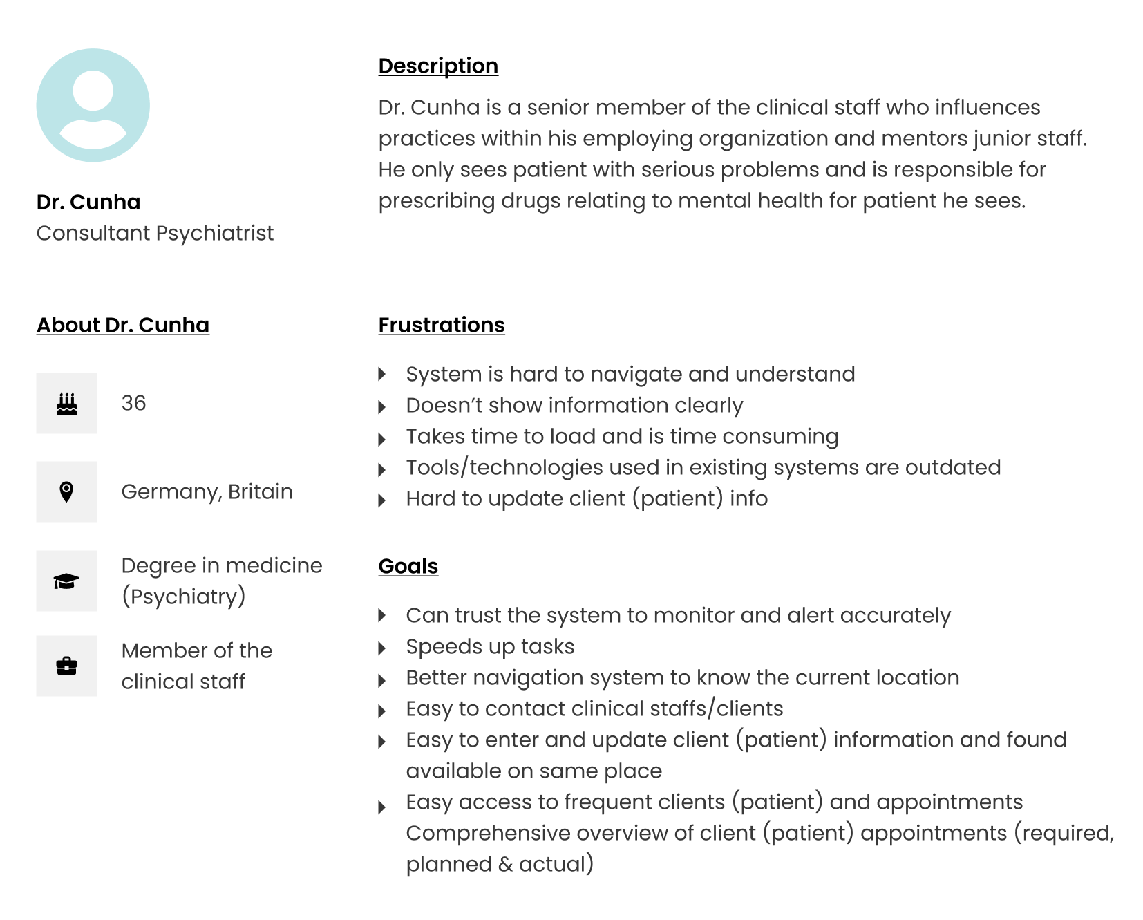
Persona
We built personas from the research to keep design decisions grounded in real roles and responsibilities — including senior clinical staff who influence practice and mentor junior staff.
Problem statements
Research into the existing product surfaced what healthcare workers actually struggled with in patient admin.
Not everyone was even on a software system — a significant amount of the work was still on paper.
- Search had no filters or categories. Finding one client record meant scanning lists.
- Client data lived in six separate places. No single view of a patient.
- No persistent navigation. Clinicians lost track of caseload, and of where they were in the system.
- No built-in calendar. Appointments were booked elsewhere, with no notifications and no way to save a part-finished form.
- No way to prioritise the waiting list. Urgent clients sat in the same queue as routine ones.
Design approach
Sketching
Based on the materials and research, we prioritised and sketched each iteration, adding elements and screens necessary to reach users' goals to see which ideas worked best.
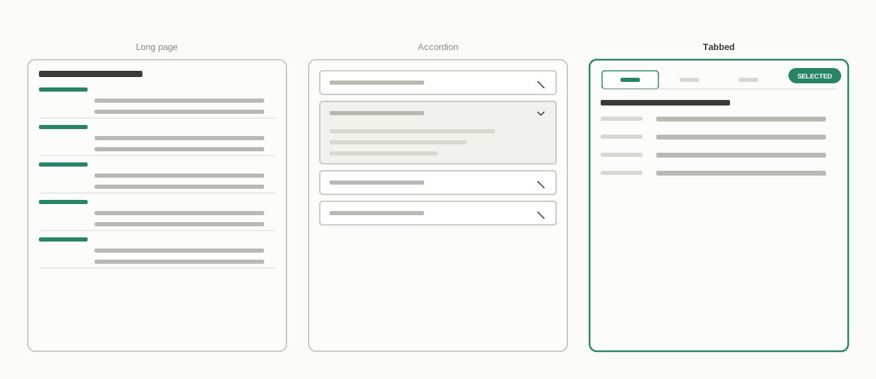
Client record — redrawn from memory, not the original wireframes. Tabbed won because it matched the problem statement directly: client data lived in six places, and grouped, findable fields beat one long page or another click-deep accordion.
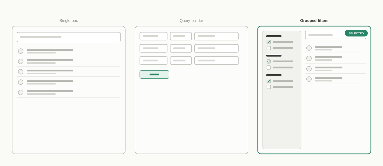
Client search — redrawn from memory, not the original wireframes. Grouped filters won: 19 controls across 6 groups, plus a lightweight dashboard dropdown for quick lookups.
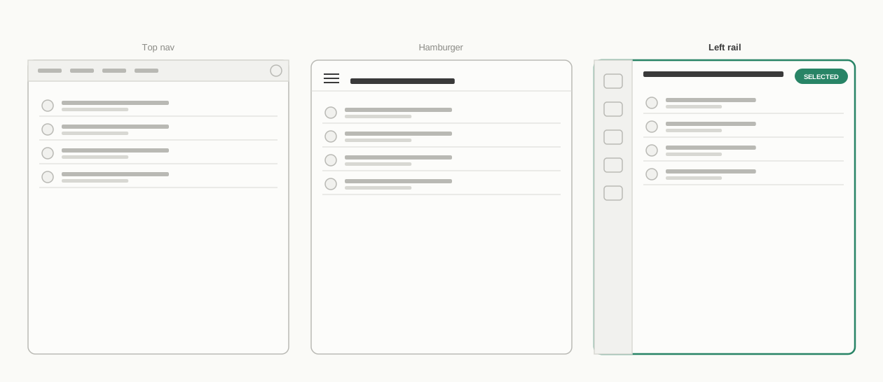
Navigation — redrawn from memory, not the original wireframes. The persistent left rail won: top-level areas always visible, sub-navigation grouped underneath, panels for short tasks.
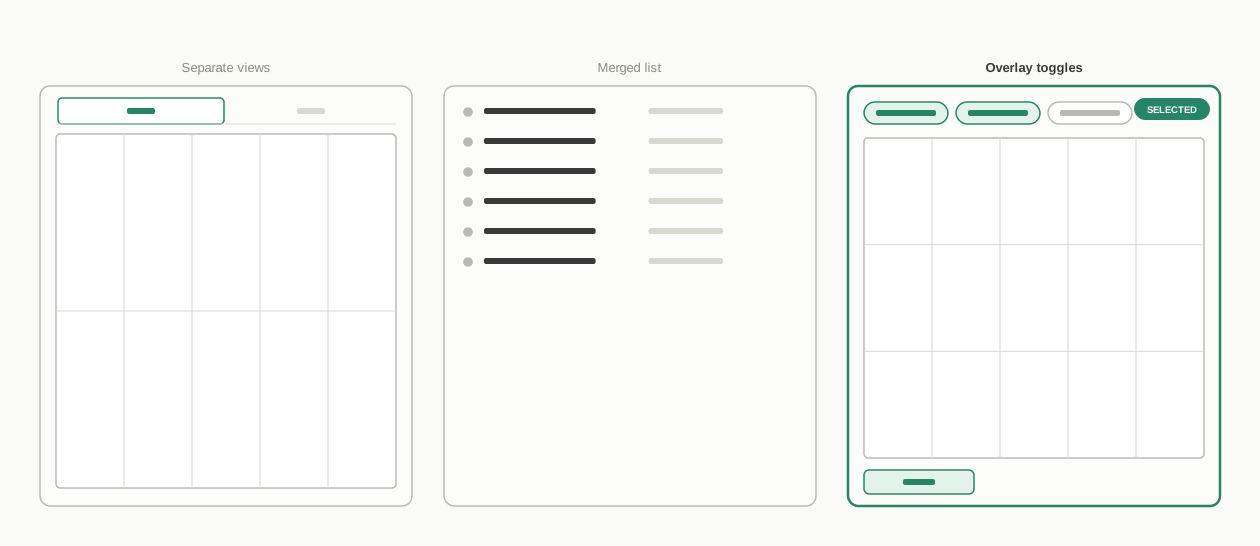
Calendar and waiting list — redrawn from memory, not the original wireframes. Overlay toggles plus priority levels won: clinic/team/staff/room overlays, waiting list mapped to the national standard.
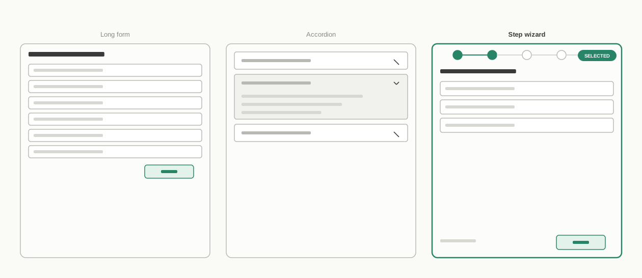
Registration — redrawn from memory, not the original wireframes. The step wizard with draft-save won: 5 steps, resumable by a colleague via a row-level edit action.
Information architecture
The structural response to the navigation problem was to consolidate what had been six separate record locations into a single client record, and to replace Paris's per-action windows with one persistent left navigation. Top-level areas — dashboard, client search, calendar, organisation administration — sit at the first level, with related screens grouped underneath as sub-navigation rather than each spawning a new window. Contexts a clinician needed only briefly, like adding a contact or configuring a widget, became panels that open in place; contexts that carried real work of their own, like the client record or the calendar, became pages in their own right. The client record follows the same logic internally: a tabbed structure, with related fields grouped into sections beneath each tab, replacing what used to be scattered across six locations.
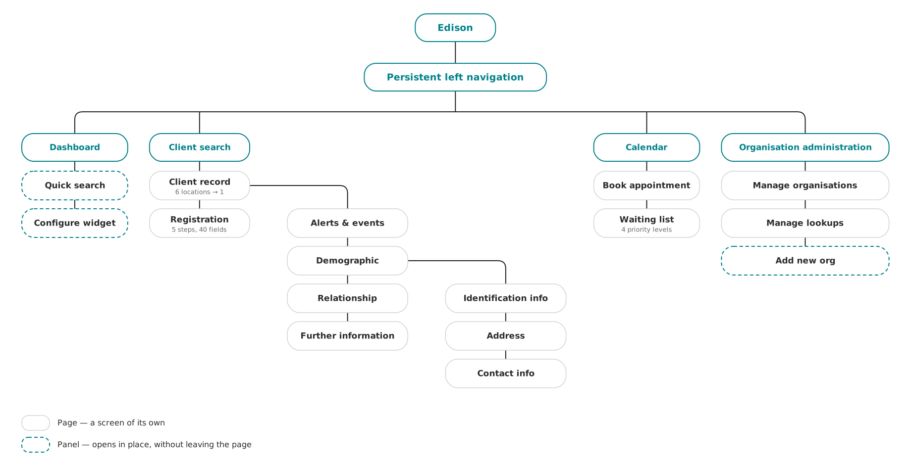
Sitemap: top-level navigation down to the client record's tabs and sections, Registration reached from client search, and the panels (Quick search, Configure widget, Add new org) that open in place rather than navigate away.
User flow
After gathering a lot of information, we had a vision in our heads of how the system would work. So, we started with mapping and created sketches in our notebooks, then finalised the flowchart.
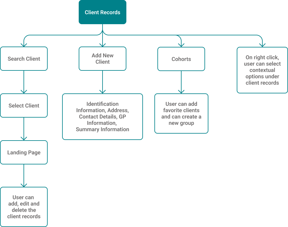
As a clinician, I can find and update a client's full record in one place, instead of piecing it together across six separate systems.
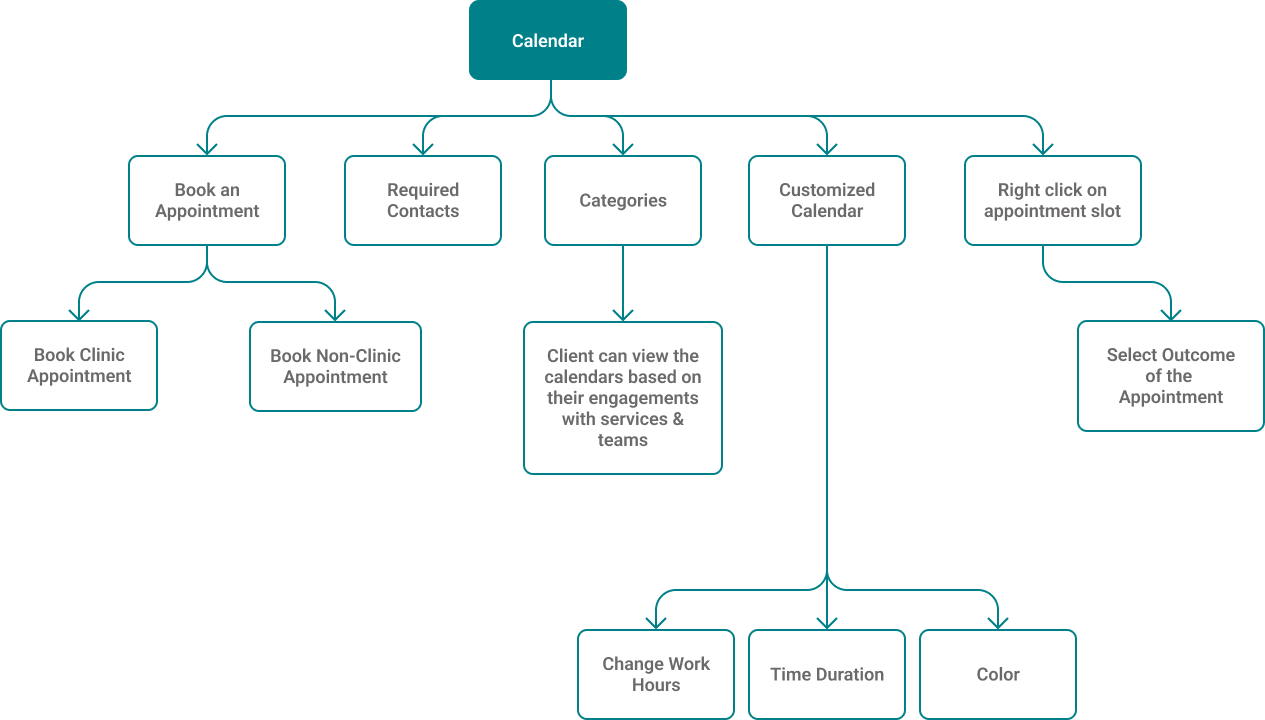
As a clinician, I can book an appointment and see the waiting list sorted by urgency, without leaving the system to check a separate calendar.
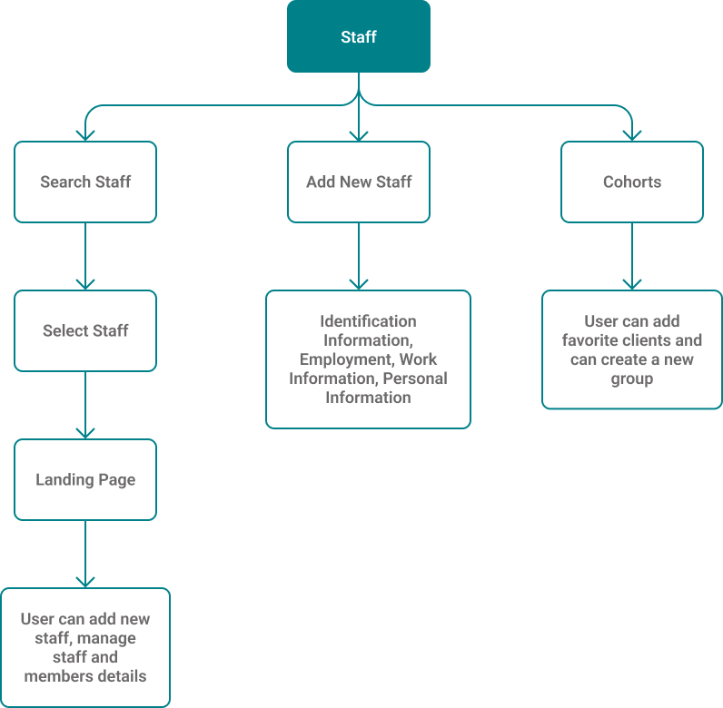
As an admin, I can manage staff accounts, roles and permissions so each clinician only sees what their role needs.
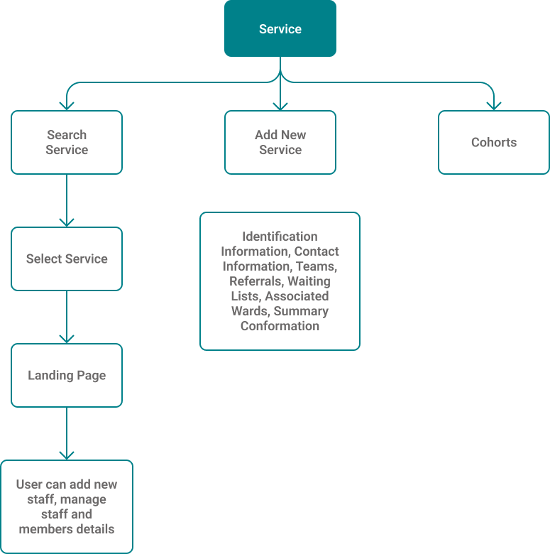
As an admin, I can set up and maintain the services my organisation offers, so they're available to attach to a client's record or appointment.
Design directions
We built an understanding of the information, interactions and processes behind efficient client care, then designed against each problem directly.
| Problem | Direction taken |
|---|---|
| Search had no filters or categories | Structured search with categorisation and filters, tolerant of incomplete identifiers at intake. |
| Client data lived in six separate places | One consolidated client record, replacing six separate locations. |
| No persistent navigation | Persistent navigation with sub-navigation and configurable dashboard widgets. |
| No built-in calendar | In-built calendar with appointment templates, available slots, and outcomes recorded in the same place. |
| No way to prioritise the waiting list | Waiting list priorities mapped to the national reporting standard, plus referrals. |
| — | Draft-saving at every step of registration, resumable by a colleague on the next shift. |
Solutions
We built an understanding of the information, interactions and processes behind efficient client care, then designed against each problem directly.
- Structured search with categorisation and filters, tolerant of incomplete identifiers at intake.
- One consolidated client record, replacing six separate locations.
- Persistent navigation with sub-navigation and configurable dashboard widgets.
- In-built calendar with appointment templates, available slots, and outcomes recorded in the same place.
- Waiting list priorities mapped to the national reporting standard, plus referrals.
- Draft-saving at every step of registration, resumable by a colleague on the next shift.
Search
Paris had no structured search. Edison has 19 search controls across 6 groups, with 6 operators and 5 tolerant-matching toggles — built for the real conditions of intake, where a client may arrive unconscious with no identifiers, or with a date of birth that is only approximate.
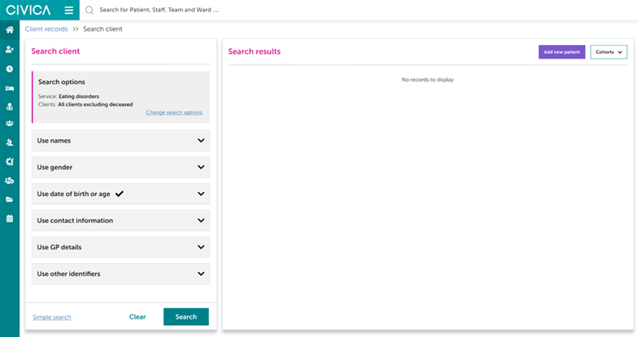
Advanced search: 19 controls across 6 groups.
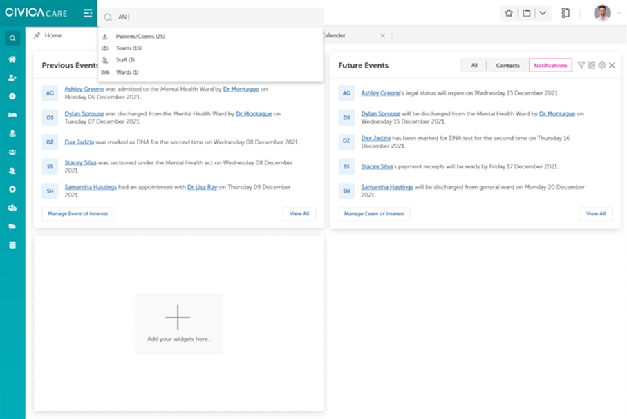
Search available from the dashboard, not a separate destination.
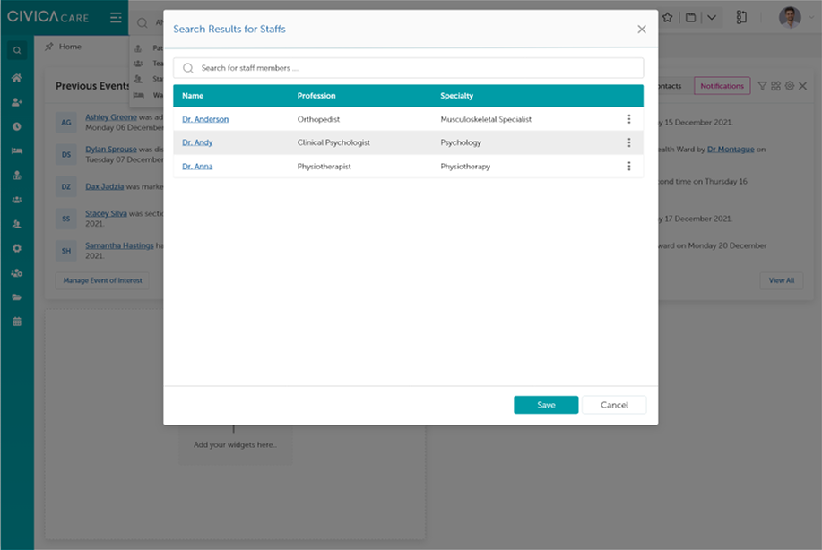
Results in context, without leaving the dashboard.
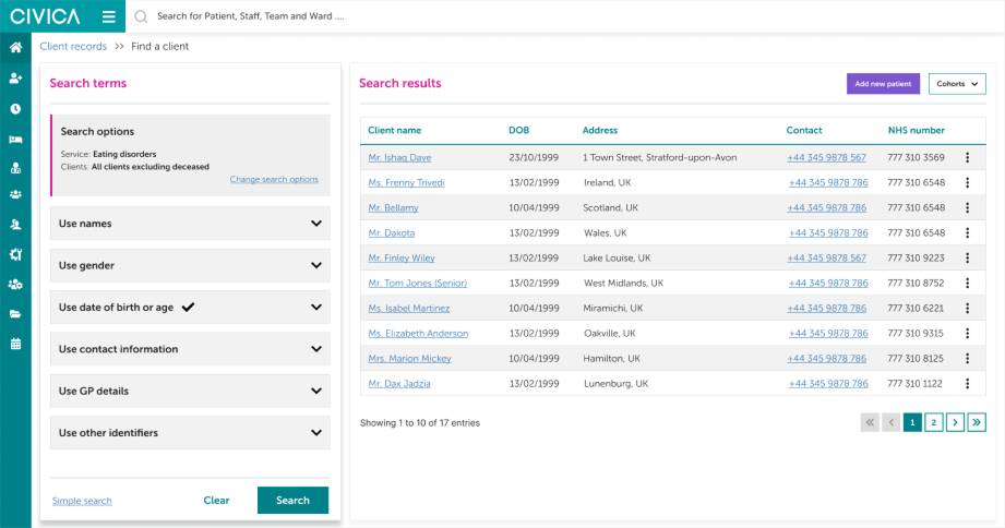
Full results view, with tolerant matching for incomplete identifiers.
The client record
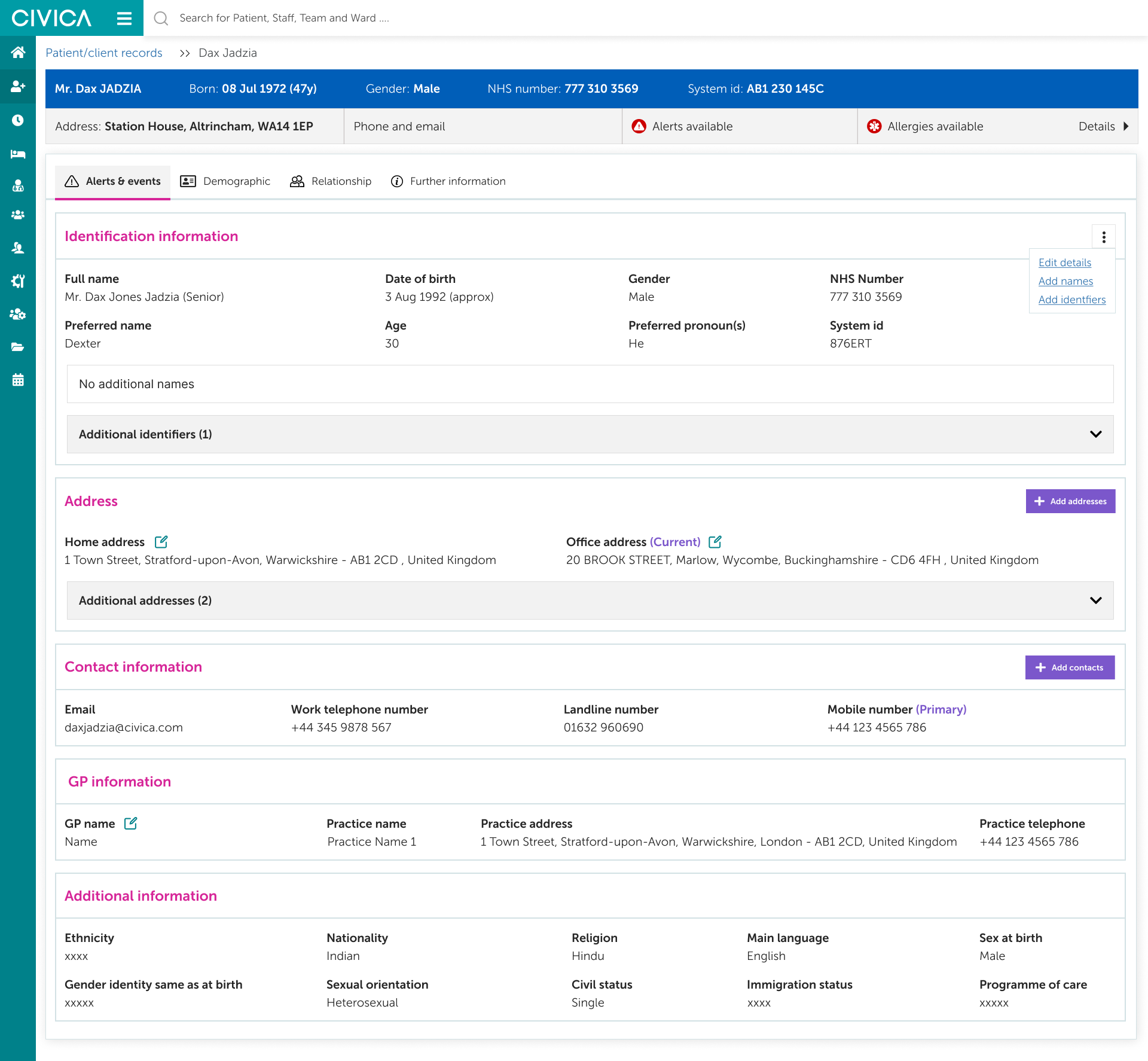
Client data lived in six places. Edison consolidates it into one record with 4 tabs, 5 sections and 28 fields, with identification and dual home and office addresses surfaced on landing.
Navigation
Panels open in place rather than spawning new windows, and the active context stays on screen while a sub-task is completed. The dashboard reopens exactly where a clinician left it, with widgets remaining configurable per user rather than fixed by role — replacing a desktop that used to fill with Paris's stacked, per-action windows.
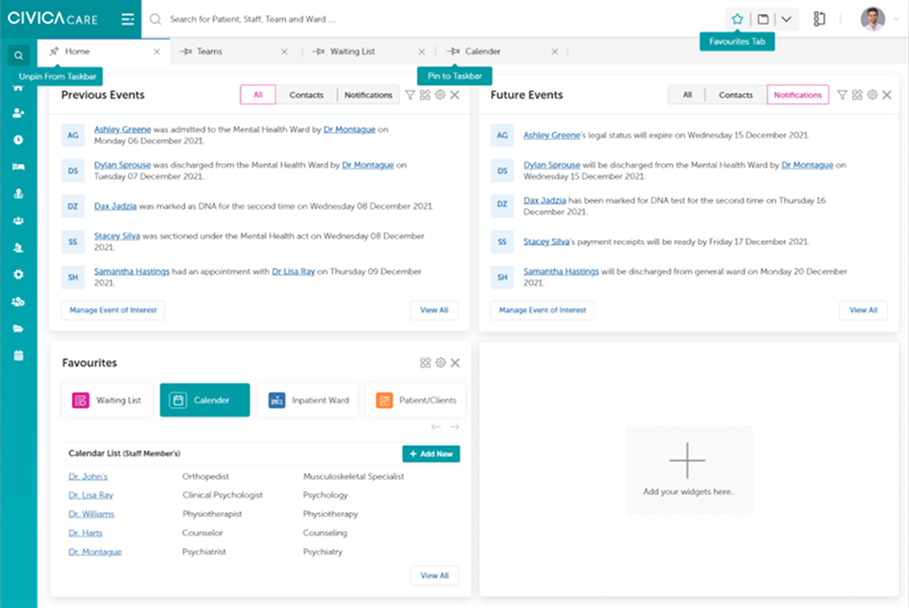
The dashboard as a persistent home, replacing a desktop of stacked windows.
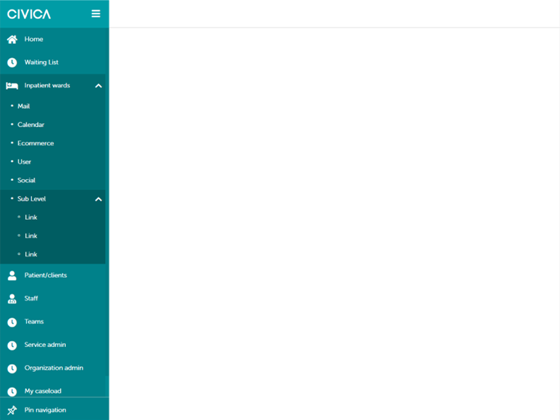
Left navigation with sub-navigation, so context is never lost.
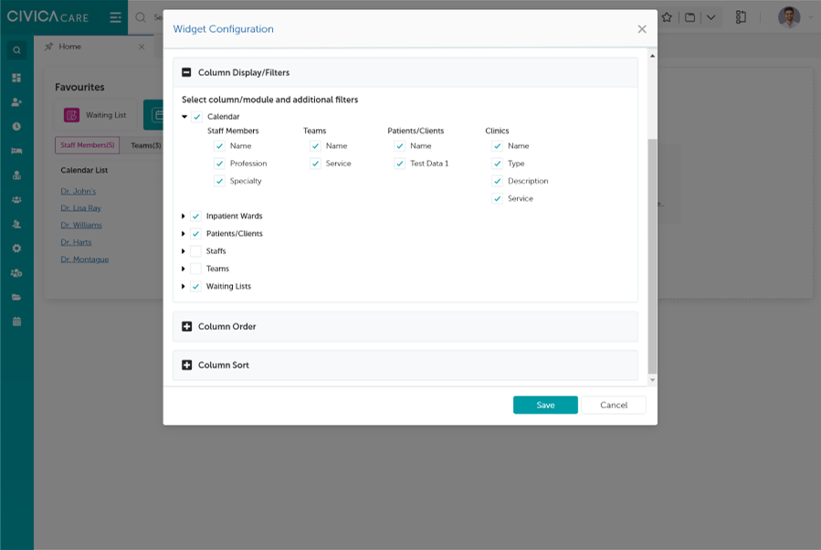
Widget configuration, letting each role shape their own landing view.
Calendar and waiting list
7 calendar categories and 15 booking fields, with overlay views across clinic, team, staff, room and cohort. The waiting list gained 4 priority levels mapped to the national reporting standard.
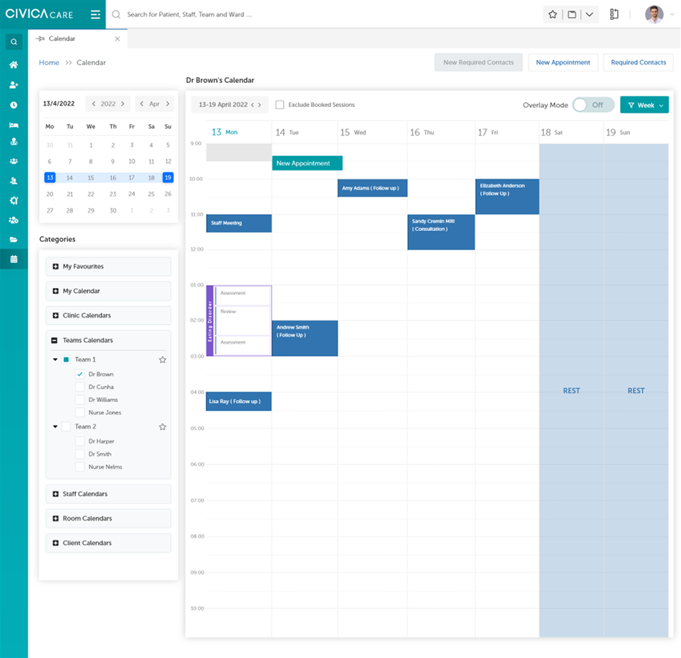
Appointments, availability and outcomes in one view.
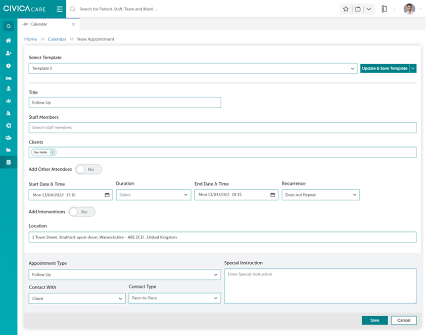
Booking against templates, with priority mapped to the national reporting standard.
Registration
A 5-step form covering 40 fields, saveable as a draft at every one of the five steps. A part-finished registration appears in search results with a row-level edit action, so a colleague can pick up a registration the originator started before going off shift. That resume path is the more useful half of the feature.
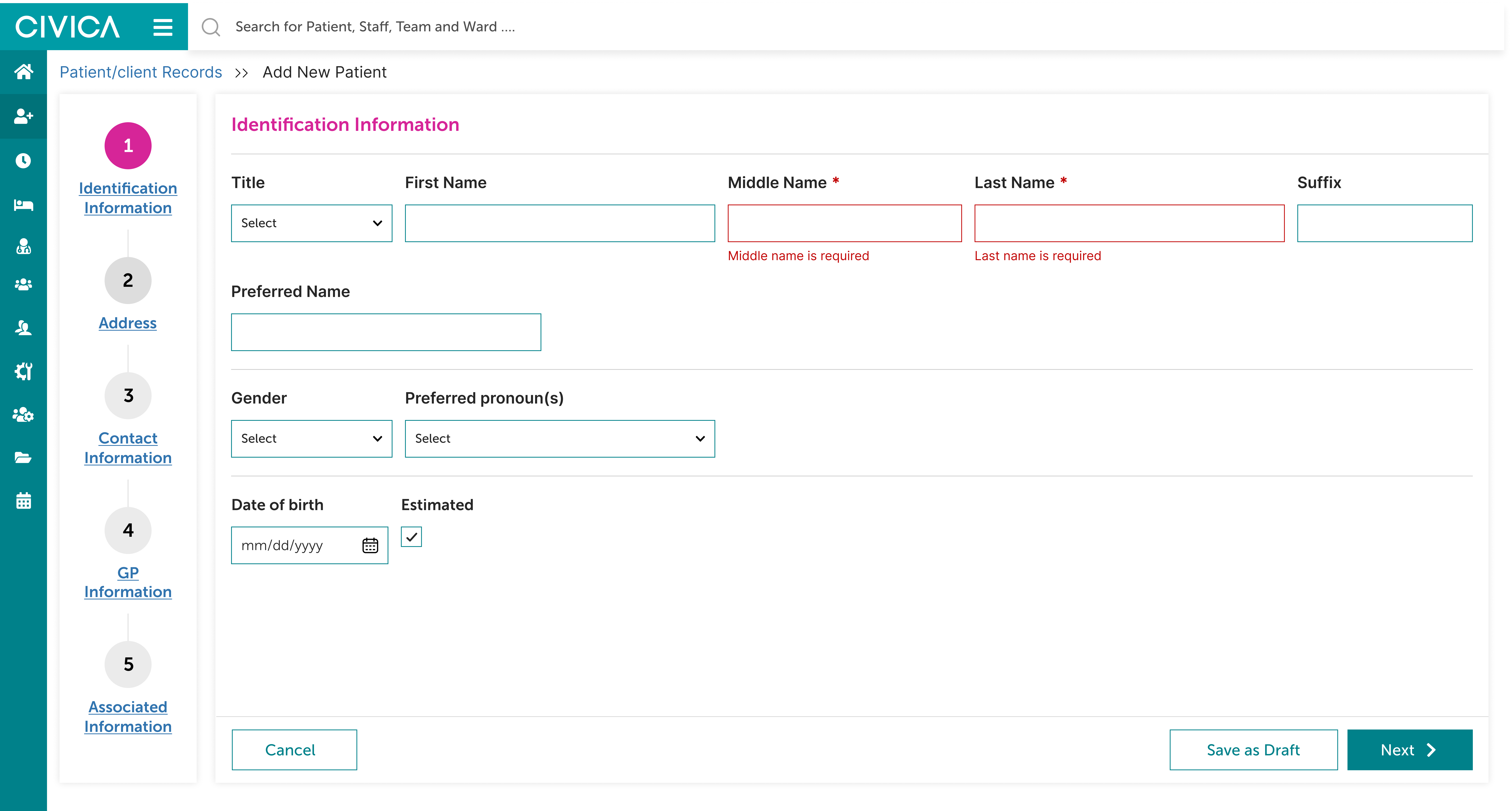
Step 1: identification information.
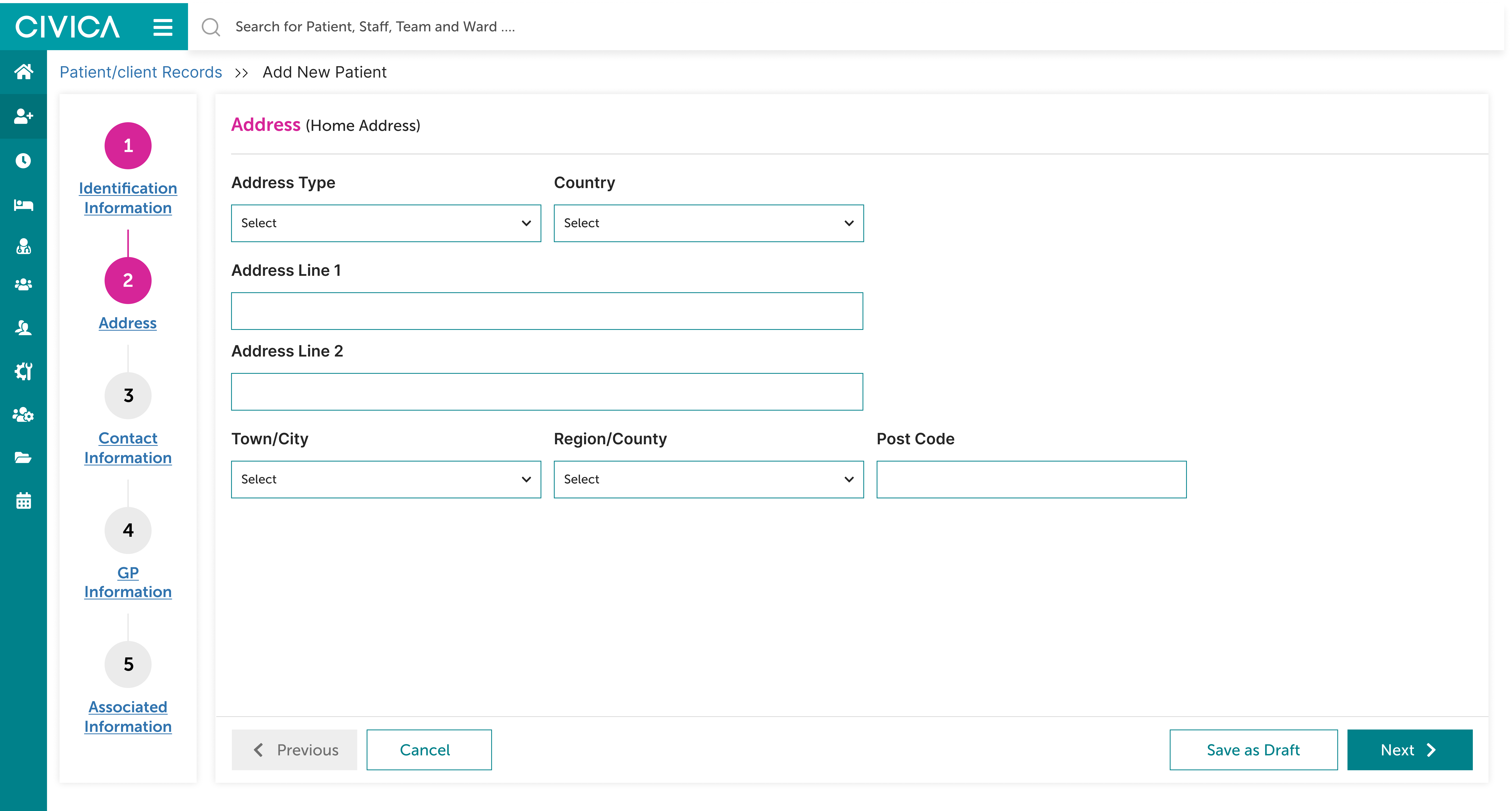
Step 2: address.
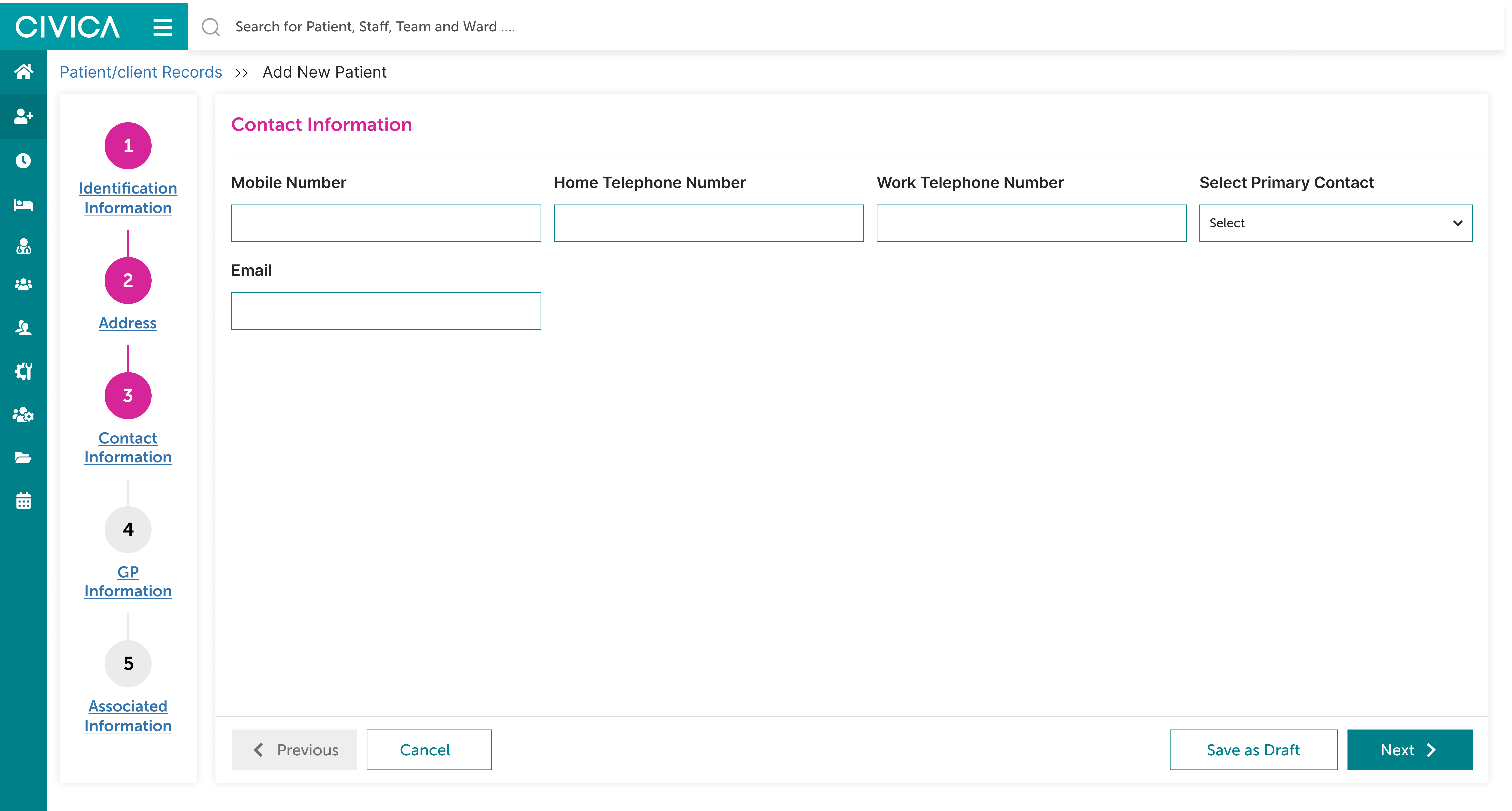
Step 3: contact information.
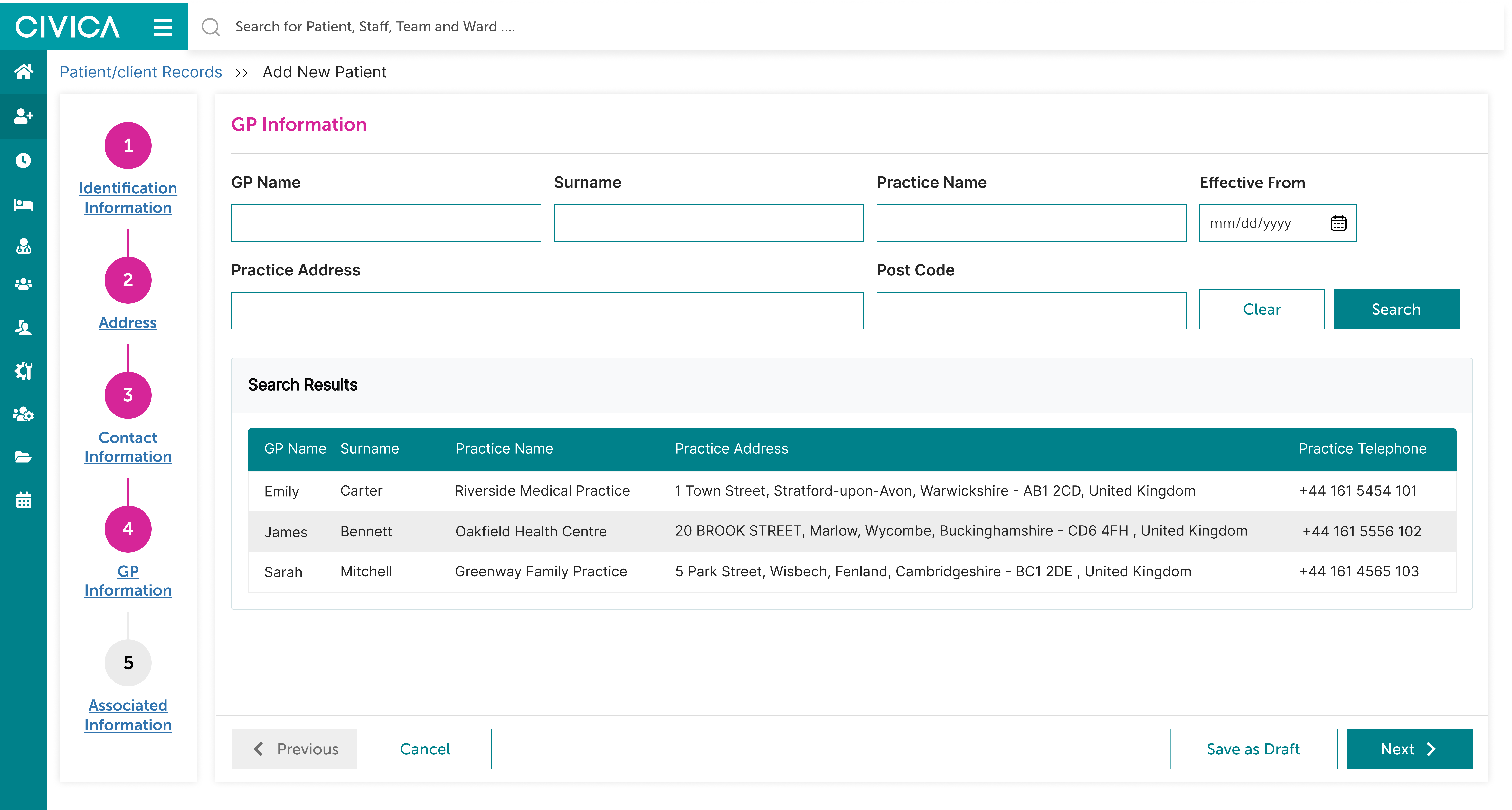
Step 4: GP information.

Step 5: associated information.
Organisation administration
Administrators manage reference organisations and administration lookup values — NHS Trusts, clinical commissioning groups, demographic categories — from screens inside Edison itself, alongside the client-facing parts of the system.
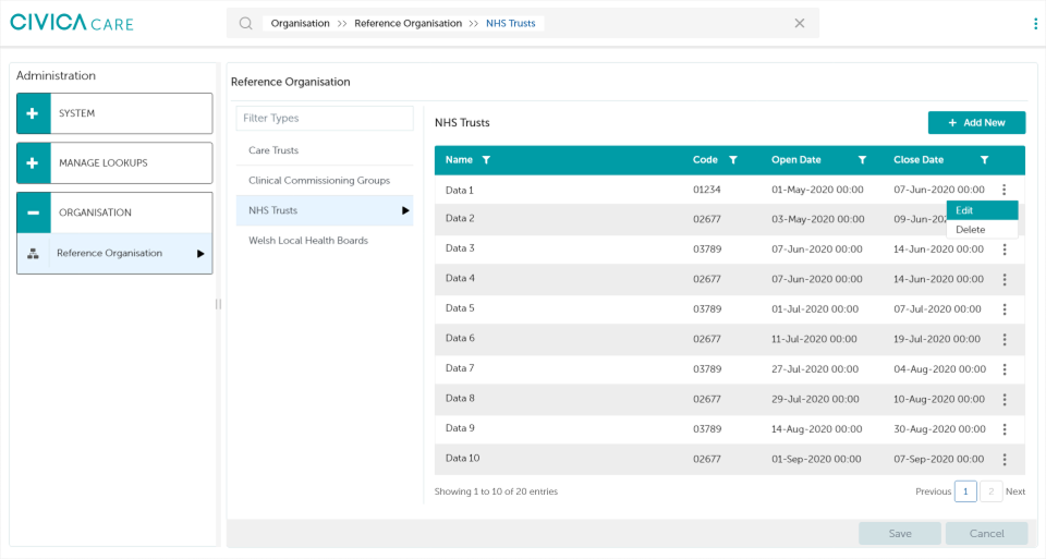
Organisation administration, kept separate from clinical workflows.
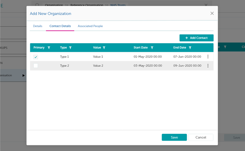
Adding an organisation.
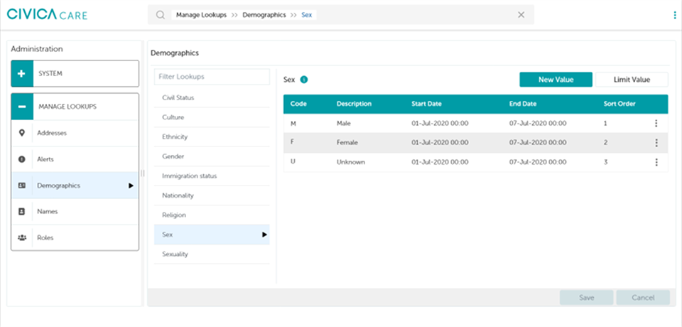
Managing administration lookups.
Validation
Under the Public Sector Bodies Accessibility Regulations 2018, WCAG 2.1 AA is a procurement condition for NHS systems, not a preference. Edison could not ship without it.
I designed and audited 63 base components to AA against a tracked conformance list, tested with NVDA, and specified keyboard focus order for every screen before handing developers HTML components rather than annotated pictures of components. 100% audit coverage across the 16 documented screens.
The accessibility investment paid measurable returns. Academic research on WCAG conformance finds that higher accessibility levels improve task completion time and completion rate for both disabled and nondisabled users. The regulation was the entry condition, but the usability benefit applied to everyone.
Beyond the accessibility audit, validation ran through the business unit: wireframes were shared for structured feedback rounds, and rework was prioritised against what came back before designs moved into build.
Results and impact
Key metrics
-
22 → 8 min
Client registration
B · client-measured -
−45%
Support tickets
B · client-measured -
−85%
Lost-progress tickets, month one
B · client-measured -
7 / 7
Pain points resolved
A · counted from designs -
6 → 1
Record locations consolidated
A · counted from designs -
100%
WCAG 2.1 AA audit coverage
A · counted from designs
Evidence
Every figure on this page is traceable to a source, and the sources are not all of the same kind. I have classified them rather than flatten them into a single confident voice.
Measured by the client. Registration time, support ticket volume and lost-progress tickets were held by the trust and reported to me. I did not hold the instrumentation.
Counted from the designs. Search controls, fields, components, screens, priority levels — all re-derivable from files I still hold.
Reported in testimony. Concurrent window counts and weekly helpdesk complaint volume came from the business analyst and subject-matter experts, not from a log.
Not retained. Post-launch error rates and adoption figures were never captured on my side. Agreeing those baselines before design started is the thing I would change.
Governance
Edison had to be lawful, reportable and accessible before it was allowed to be good. Four frameworks shaped the design directly:
| Framework | What it required | Where it shows in the design |
|---|---|---|
| Mental Health Act 1983 | A client's legal status under the Act had to be identifiable at a glance, not buried in notes | Legal status displayed on the client record |
| MHSDS Clinical Response Priority Type | Waiting-list priority coding aligned to the national reporting standard | The national standard behind waiting-list priority |
| PSBAR 2018 | WCAG 2.1 AA conformance, as a procurement condition rather than a preference | WCAG 2.1 AA as a contractual condition |
| Caldicott principles | Access to client data accountable to an audit trail | 100% staff access logging |
The notification layer displays Mental Health Act status. It does not route, own or escalate it — a distinction worth stating precisely, because in a clinical system the difference between showing information and acting on it is the difference between a design decision and a safety claim.
Reflection
01
Measure before you design
If I ran this project again, I would settle measurement baselines before design started. The trust held the instrumentation for post-launch metrics, which meant I never saw error rates or adoption figures. Those numbers would have told a different story about what shipped well and what didn't. User-facing evaluation sat with the trust throughout, so I can point to accessibility conformance and stakeholder review rounds with the business unit, but not to moderated usability testing findings.
02
Regulation as leverage, not limitation
The regulatory constraint turned out to be enabling, not limiting. WCAG 2.1 AA forced the accessibility work upstream instead of downstream, and every usability gain from that upstream investment benefited clinicians regardless of disability status. It taught me that lawfulness and usability are not separate problems.
03
The system should disappear
The bigger lesson was about window management itself. The user research showed that clinicians carried cognitive load purely managing the interface, not just using it. When you remove that cognitive tax, the system disappears and the work becomes visible again. That's the threshold between a system and a tool.