Edison
UX Case Study
Project Overview
Edison is a new patient/client management system, part of the NHS Health and Care department. Edison's stated aim is to deliver world-class, intuitive administrative functionality to support the planning and delivery of care. It's a replacement for the existing Paris product.
Edison focuses on the administrative tasks carried out as part of clinical processes, with the aim of minimising the administrative overhead of providing client care.
Roles & Responsibilities
- Analysis of Research Report & Discovery
- Wireframes & Prototyping
- UI Design & Development
- Accessibility Testing
Problem Statements
The current product available in market shows the frustrations, concerns, and desires of healthcare workers in relation to patient admin — not all workers currently use software systems, and a lot of paper is still in use.
Some of the problems we cared about below:
- Searching for client records is very time-consuming due to no categorisation/filters.
- Hard to find all client records in one place.
- Hard to keep track of records or caseload due to lack of a navigation system.
- Absence of features such as an in-built calendar tool to easily book appointments, set notifications, and keep records of drafts to save progress.
- Unable to prioritise clients in the waiting list, or save records of drafts to resume progress.
Solutions
We set out to build an understanding of the information, interactions, and processes key to administering efficient and effective client care.
Some of the problems covered such as:
- Improved navigation system with several options and customisation.
- Dedicated record section with categorisation to store and view client's data in one place.
- Booking an appointment is easier due to in-built calendar functionality, letting users choose a template for required clients and see available slots — and view the outcome of the appointment in the same place.
- Features such as referrals and setting priorities for client appointments can be done in the waiting list.
User Research
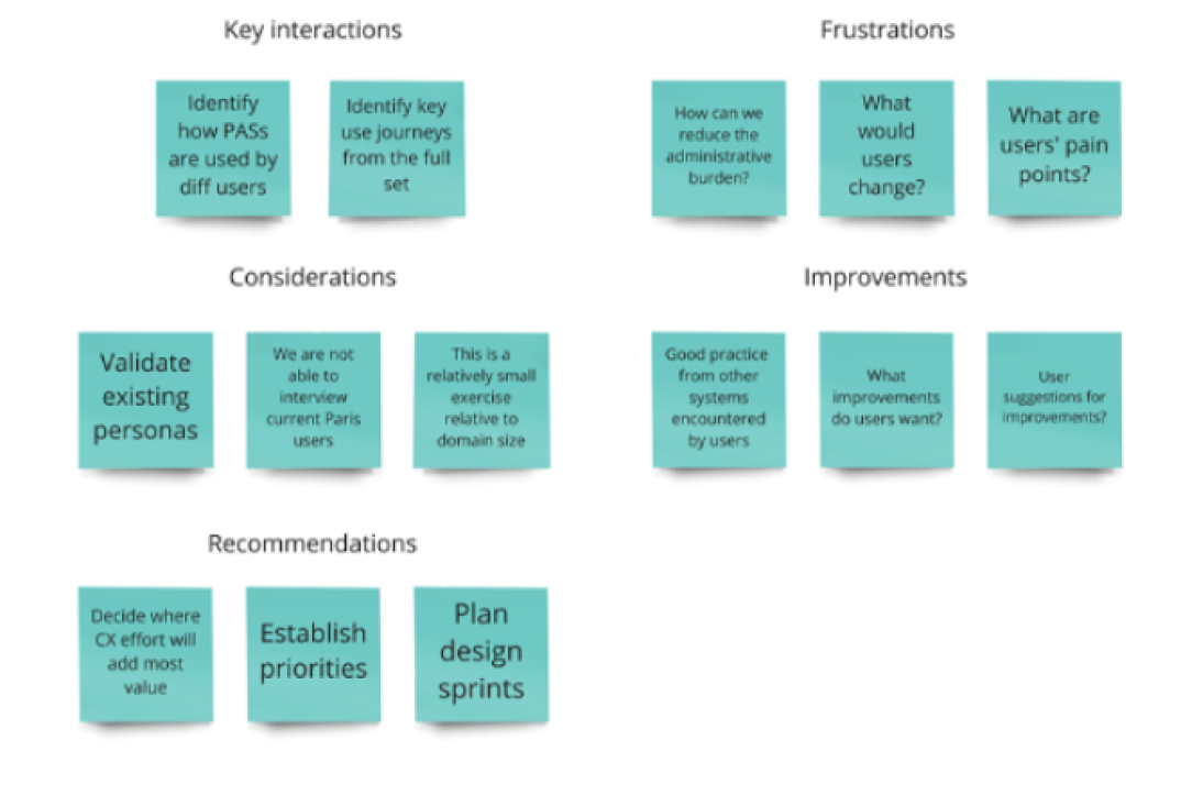
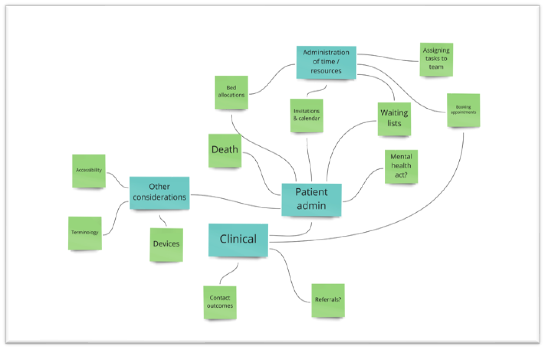
To understand users' frustrations, goals, and requirements, Central Government conducted user research and created user journeys and personas based on the existing system by conducting user interviews. Analysis was carried out on approximately 50 user journeys to gain insight into roles, explore relevant client-admin tasks, and identify high-level use cases to assist in forming a recruitment strategy for participants in user research interviews.
Client Questions:
Key objectives included gaining an understanding of participants' roles and responsibilities, what systems they used and how their tasks were carried out, any challenges faced, the terminology used, and any access needs or assistive technologies used.
Secondary Research
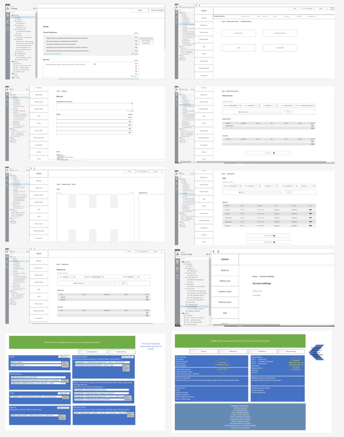
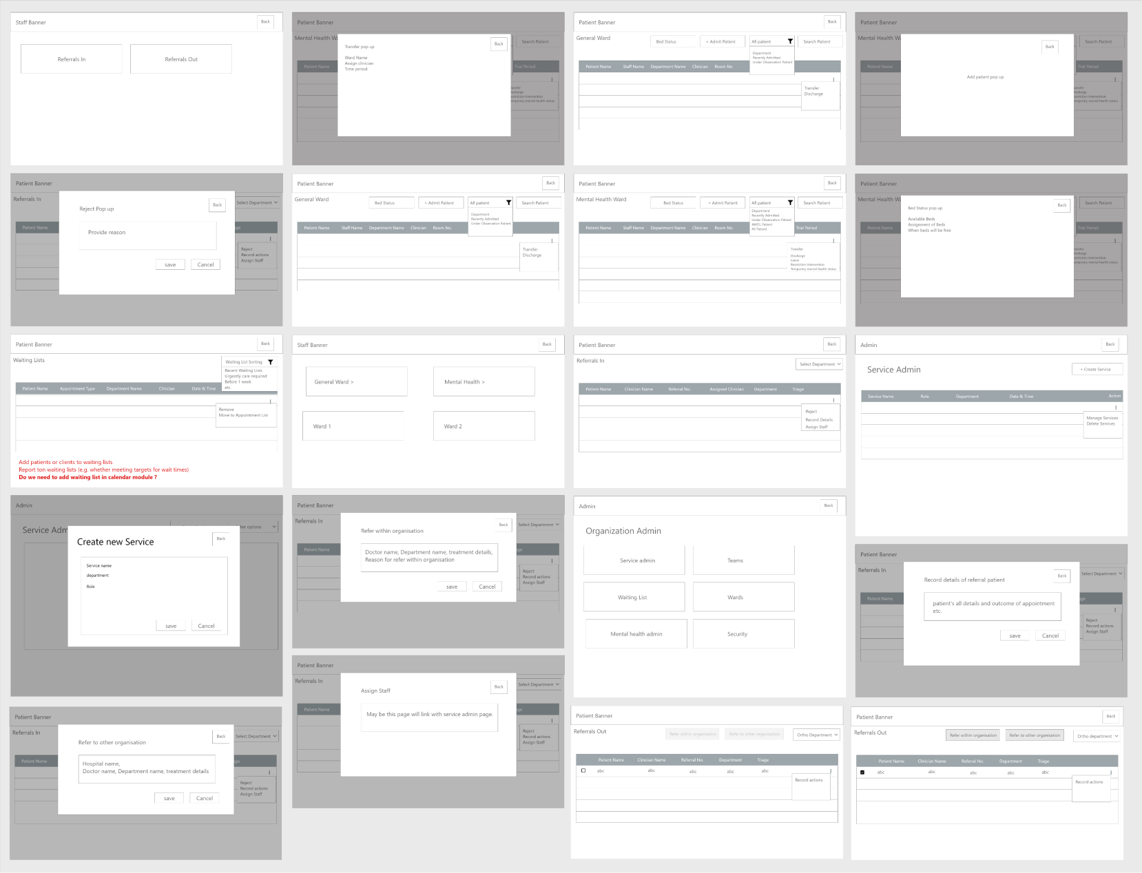
Our team started off with a meeting to go over the project plan and familiarise ourselves with the existing product as well as user requirements. Since this project is a replacement/continuation of the initial Paris project, we were given a lot of documentation to review by the Health & Care team. We went through other products available online to get better insight into functionalities such as referrals, waiting lists, organisation admin, and cohorts, while also reviewing documents and wireframes given to us by the business unit.
User Persona
We built personas from the research to keep design decisions grounded in real roles and responsibilities — including senior clinical staff who influence practice and mentor junior staff.
Dr. Cunha
Consultant Psychiatrist
About Dr. Cunha
Age 36 · Germany, Britain. Degree in Medicine (Psychiatry). Member of the clinical staff. A senior member who influences practices within his employing organisation and mentors junior staff. He only sees patients with serious problems and is responsible for prescribing drugs relating to mental health for the patients he sees.
Frustrations
- System is hard to navigate and understand
- Doesn't show information clearly
- Takes time to load
- Uses outdated tools/technologies
- Hard to update client info in
Goals
- Quickly find and update patient records
- Track caseload and prioritise urgent clients
- Prescribe and document medication efficiently
- Mentor junior staff with a system that's easy to demonstrate
User Flow
After gathering a lot of information, we had a vision in our heads of how the system would work. So, we started with mapping and created sketches in our notebooks, then finalised the flowchart.
Set a goal
It was important to understand what exactly users would want to accomplish using the system. We went through user stories and reviewed discovery findings with the Edison product management team to get a clear vision of design goals.

Sketch it out
Based on the materials and research, we prioritised and sketched each iteration, adding elements and screens necessary to reach users' goals to see which ideas worked best.

Iterative Design
We converted those sketches into a vision to build an attractive system that complements our style guidelines, and shared the work with the business unit (BU) for detailed feedback.
Dev handoff
Before developing HTML components, we reviewed our designs and connected with developers to educate them on the user flow, aligning with the CIVICA design system and WCAG AA accessibility criteria.
Fifteen core screens, designed in Figma — covering client search and records, scheduling, and organisation administration, handed off to developers as HTML components built to WCAG AA standards.
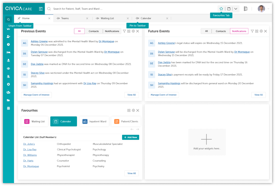
Dashboard
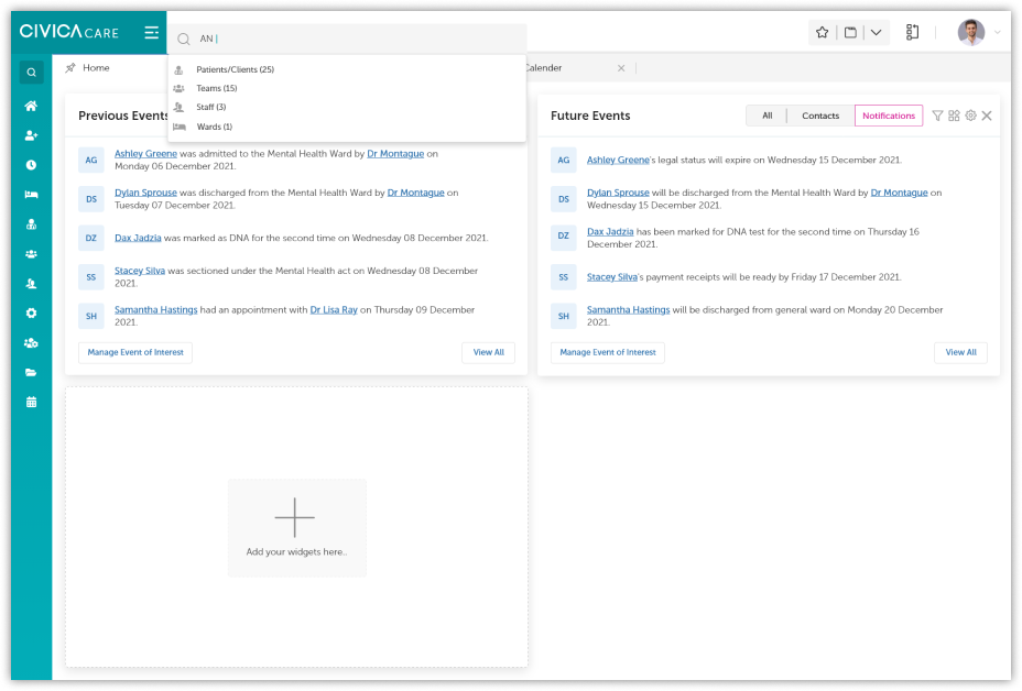
Dashboard search
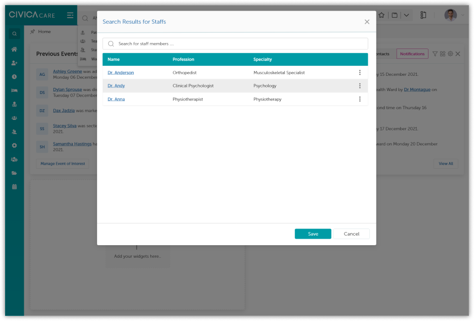
Dashboard search results
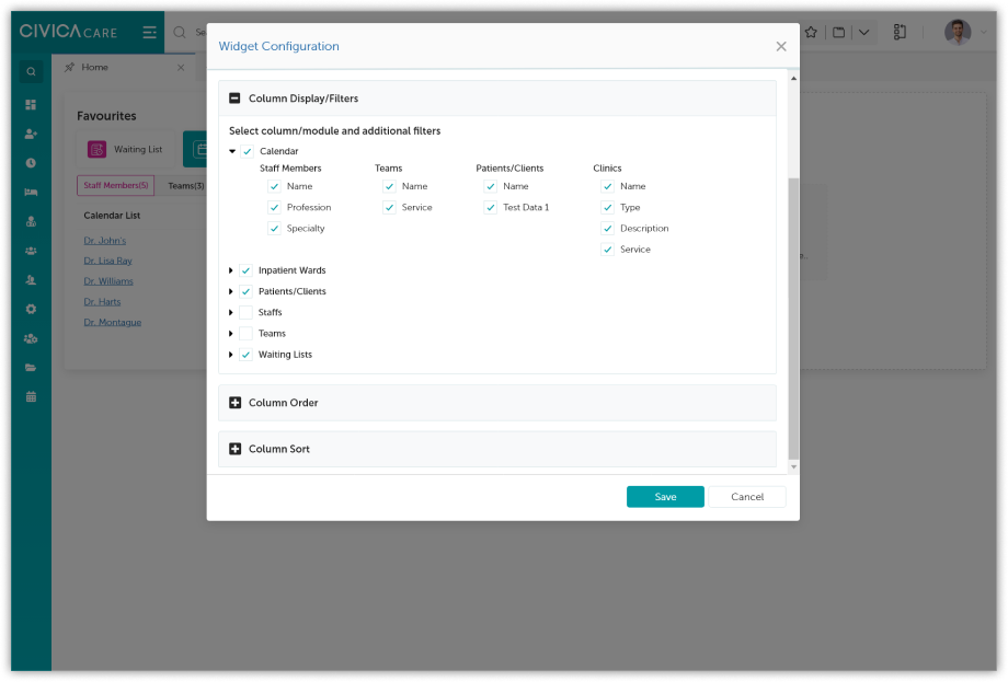
Dashboard widget configuration
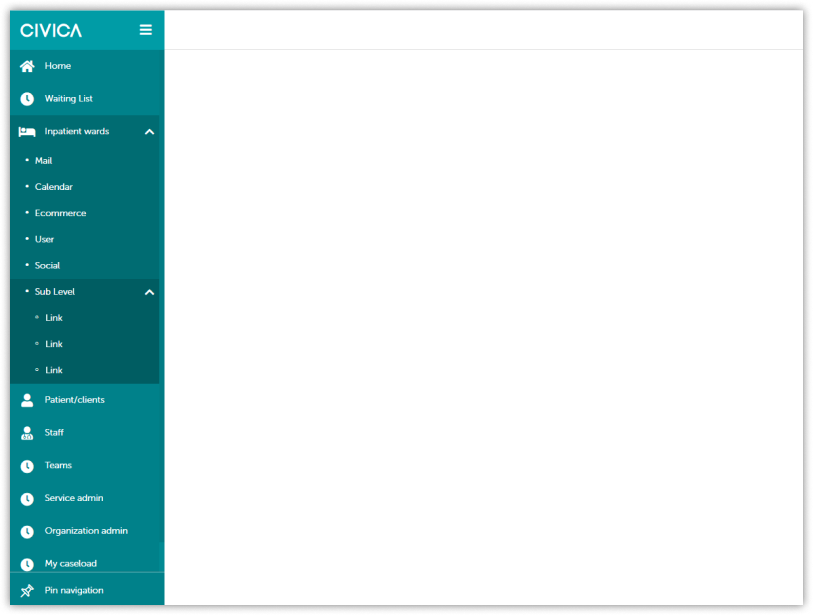
Left side navigation with sub navigation
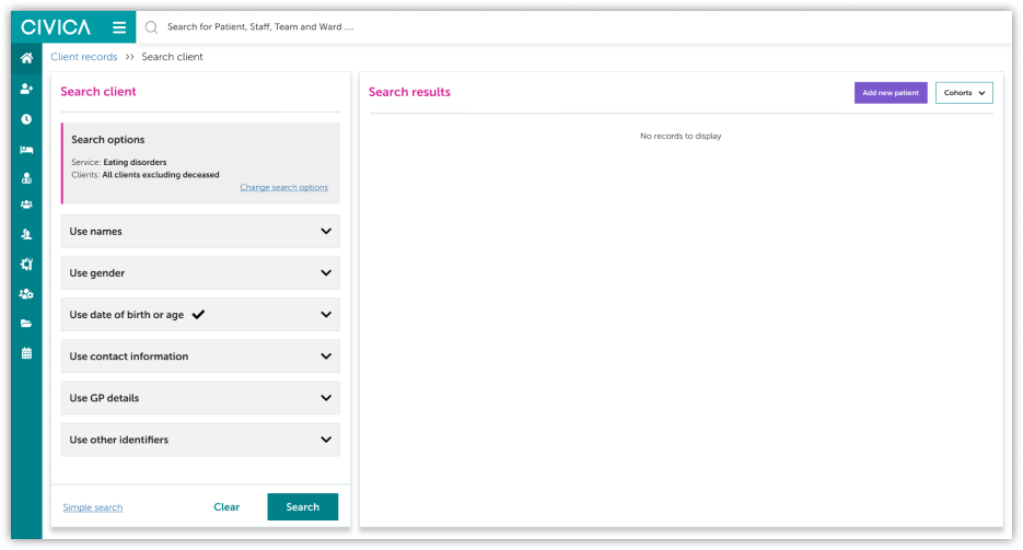
Advanced search terms panel
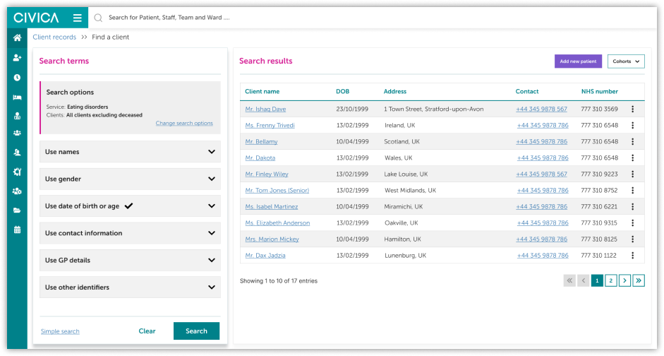
Search results
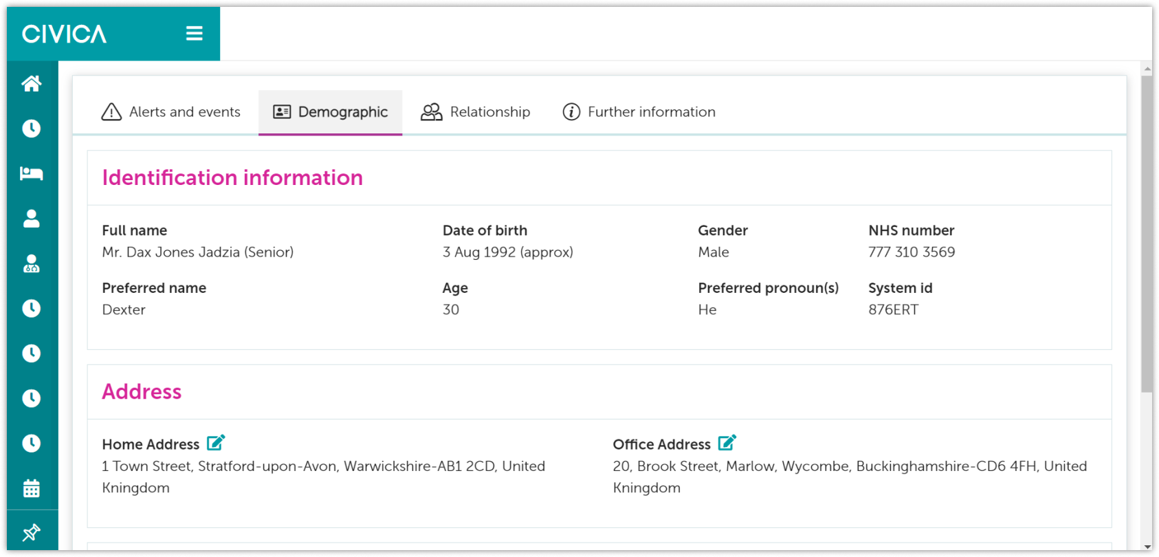
Client landing page
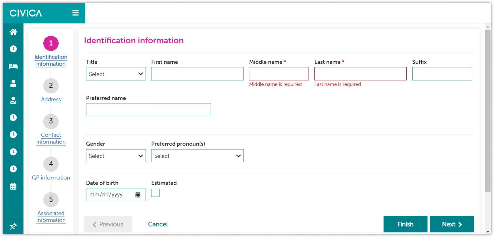
Add new client
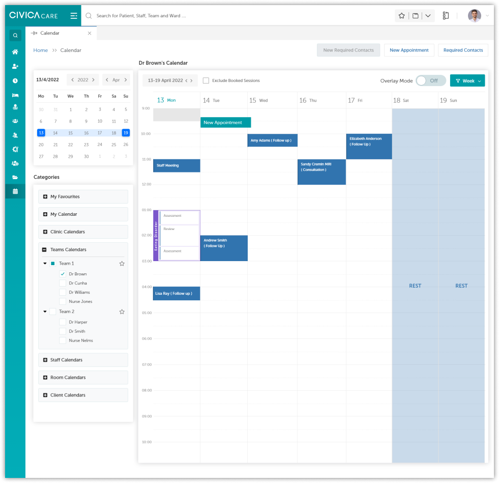
Calendar
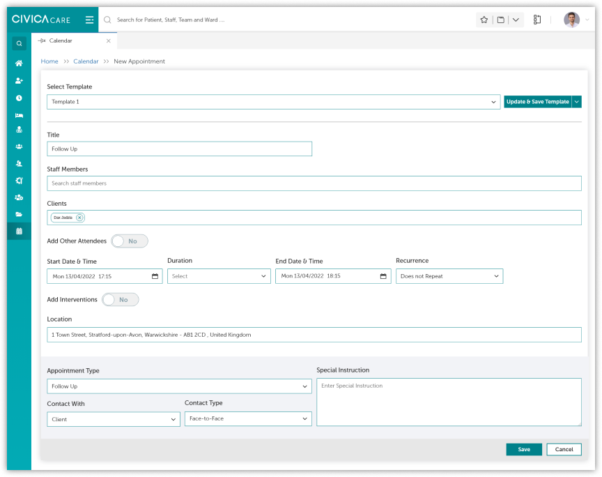
Book new appointment
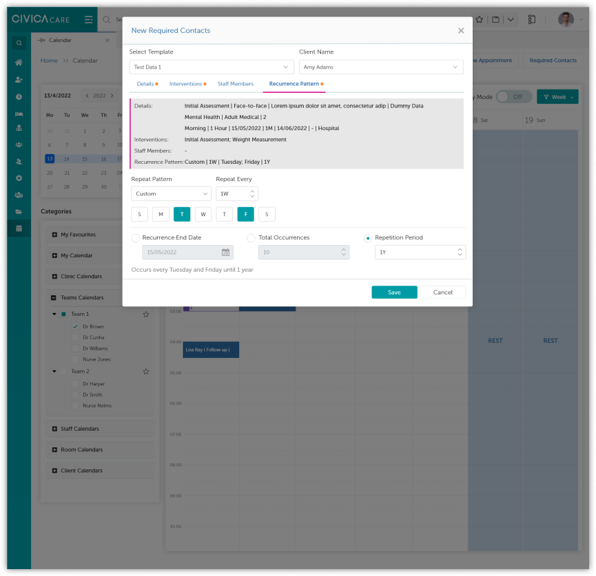
New required contact pop up
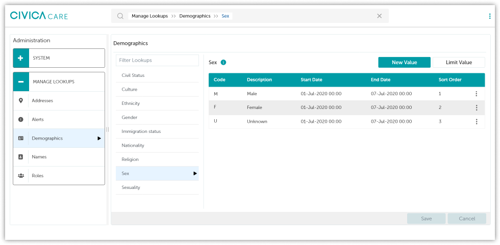
Manage administration lookups
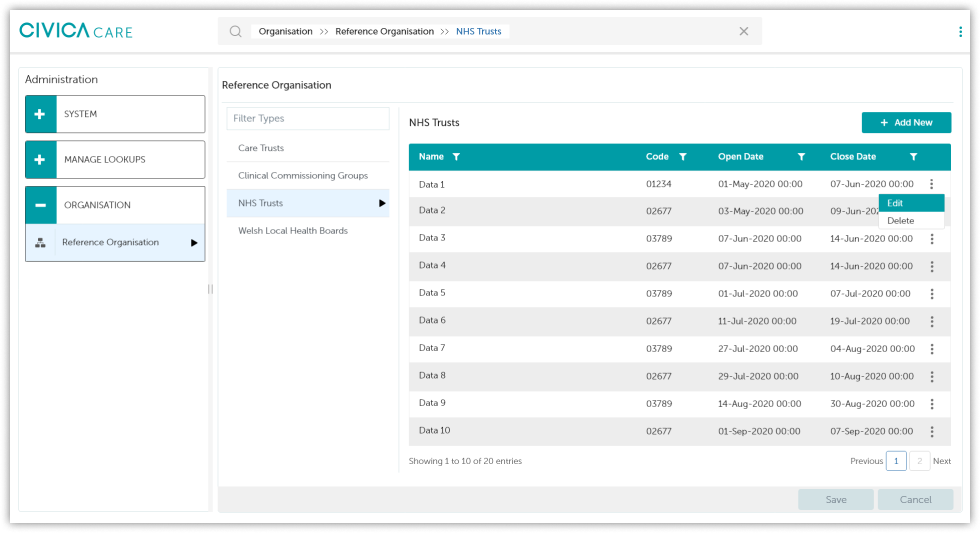
Organization admin
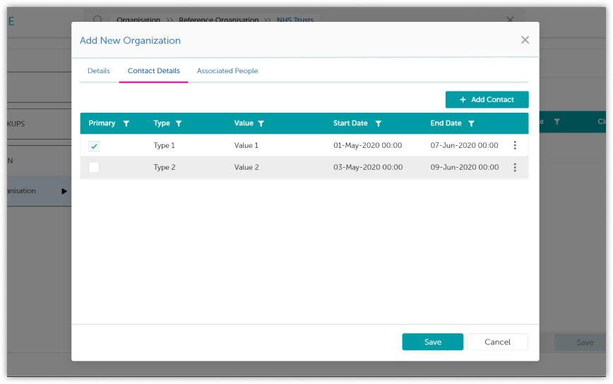
Add new organization (admin)
As the system is designed to support the planning and delivery of client care using an intuitive administrative system, it is highly accessible and covers WCAG 2.1 AA accessibility criteria. System users are invited to "Skip to the content" of each page; layouts are clean and easy to understand by sighted users and users with low vision alike.
Skip to Content
Every page invites users to skip to the main content, avoiding repetitive navigation for keyboard and screen reader users.
High-contrast Text
High-contrasting text throughout, with ARIA tags and thorough HTML page structuring.
Responsive Design
Covers a diverse range of devices, from smaller to larger screen resolutions.
Screen Reader Tested
Tested with the NVDA screen reader, enabling people with blindness, visual impairments, and/or reading disabilities to browse the system by having text and alternative text read aloud.
Conclusion
By trying to cover users' requirements and offering solutions to the problems faced in the previous system, we delivered administrative functionality for providing efficient and effective client care. Improved navigation, built-in calendar capability, a record section with categorisation to store and view clients' and staff members' data in one location, and organisational administration manage lookups are all features we included.
We then provided developers with HTML components built with WCAG AA accessibility standards in mind, so they could use them to build a whole page. By sharing the wireframes with the BU, soliciting their feedback, and prioritising rework on a few critical design aspects, usability testing was conducted.